Ir para o conteúdo principal
Aceder ao painel de controlo
Não sabe ao certo por onde começar? Responda a um breve questionário para receber recomendações personalizadas.
The Dong-A Ilbo

Dong-A Ilbo increases engagement through improved UX

Dong-A Ilbo’s revamped website focuses on reader readability, convenience and personalisation.

The Challenge

Media outlets face the tough challenge of preserving their unique identities while adapting to new trends in a swiftly evolving media landscape. It’s a big task: consistently delivering quality news that matches the varied tastes and preferences of readers, placing them at the center of digital transformation and innovation.

Traditionally in South Korea, readers have preferred accessing news through portals rather than direct news websites, a trend that has long dictated the strategy for news distribution. But the times are changing. Media outlets, recognizing this shift, have started to boost their competitiveness by enhancing their digital presence and innovating online.

In response, numerous outlets have been crafting strategies to drive consistent traffic to their websites and build a loyal readership resilient to these changes. Among these, Dong-A Ilbo has been a proactive participant.

Established in 1920, Dong-A Ilbo stands as a testament to the rich history of Korean journalism and remains one of the leading newspapers in Korea today. With a longstanding commitment to fostering robust journalism, Dong-A Ilbo has embarked on discussions to enhance and strengthen its platform’s independence. Through its recent website overhaul, the newspaper aims to secure and grow its readership by developing fresh content and improving the user experience (UX) on its site, thereby strengthening its brand identity, and attracting new followers.

The DongA Ilbo_동아일보_Headshot_Shin Suk Ho
"Dong-A Ilbo’s online platform operation team, which has maintained a constant state of redesign since the 2020s, took a leap in web page design and composition through a UX/UI renovation with the Google News Initiative (GNI) program in 2023. Along with the 'News for All,' Dong-A Ilbo made a bold attempt to introduce the 'News for You' section, a carefully curated selection of news that readers choose themselves based on individual usage patterns, on the main page. With wide and large images applied to the main page to suit the visual era, and article pages designed to lead readers to consume other articles and revisit the site after reading one article, the responsive design for PC and mobile was also introduced. Dong-A Ilbo's new efforts with Google received feedback from readers as 'innovative' and 'audacious.' Despite the global trend of declining text article consumption, the number of active users on Dong-A Ilbo’s online platform increased after the redesign."
Shin Suk Ho
Executive Director; DongA.com

The Result

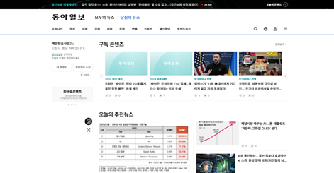
Dong-A Ilbo's website transformation centered around three principal themes: "Distinguishable," "Personalizing," and "Interaction." These enhancements focused on improving the user experience (UX) and solidifying a distinctive brand identity, which significantly elevated the site’s appeal.

The website revamp kicked off with a shift from text-heavy presentations to a visually driven layout, employing big images to make a striking visual impact. Adjustments in font styles and text spacing were made to optimize readability. The site evolved from an adaptive design—where mobile and PC formats differed—to a responsive design, ensuring a consistent viewing experience across devices. The search function was enhanced, and navigation menus were simplified, making the news service more accessible and user-friendly.

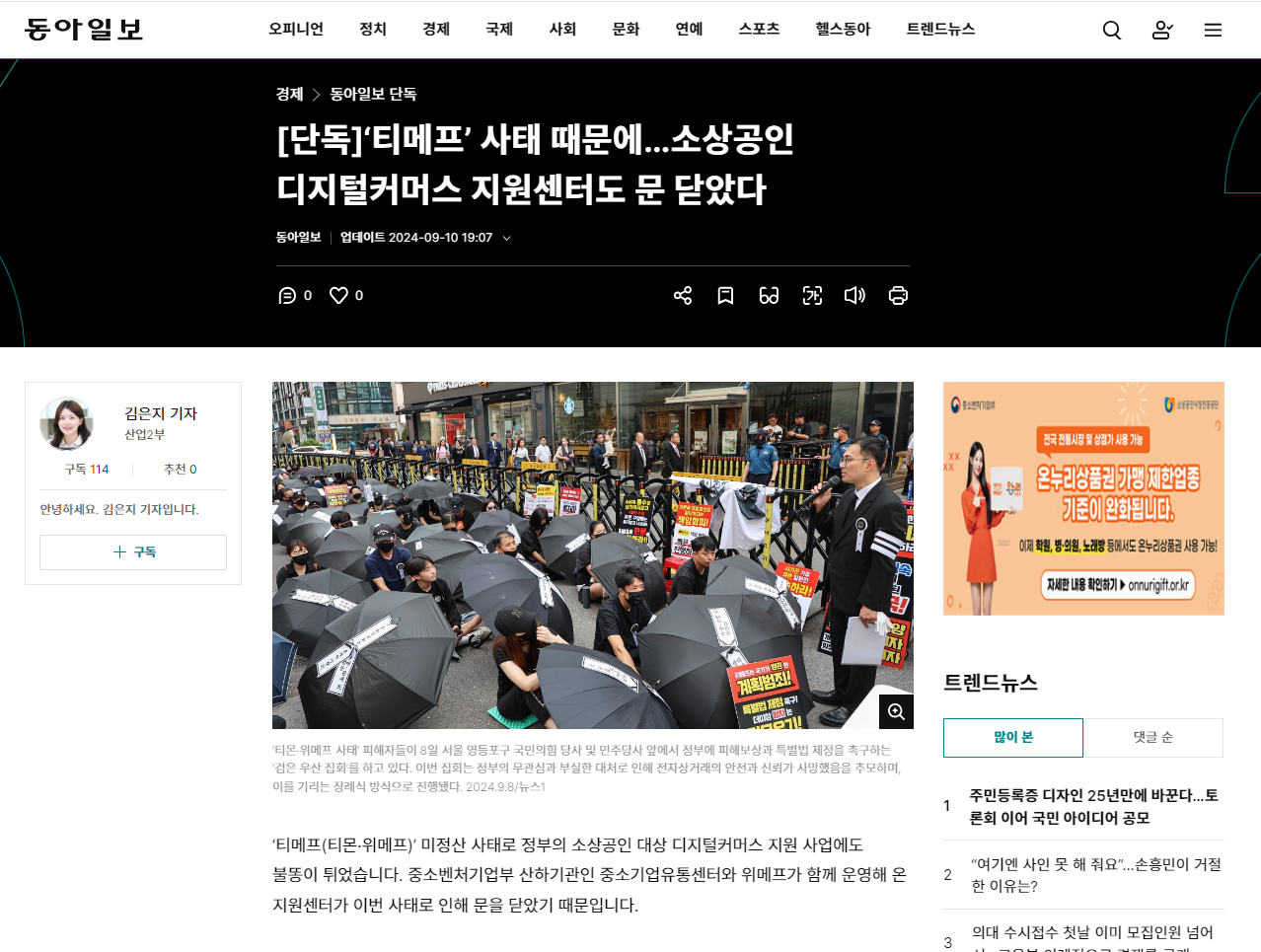
To strengthen its brand identity, Dong-A Ilbo revamped visual elements to make its articles instantly recognizable. Each article's title area was standardized with the outlet's signature black color, helping readers easily identify the source as Dong-A Ilbo.

Further distinguishing itself from conventional news outlets, Dong-A Ilbo introduced two innovative services: "News for You," aimed at boosting page views, and "News for All," which curates articles based on reader interests.

Additionally, the site limited the number of ads per page, which not only improved content focus and readability but also reduced page loading times, enhancing the overall user experience.

These updates have led to great results. Dong-A Ilbo enjoyed a 17% boost in new subscribers after its website makeover. The newspaper plans to leverage data from this new wave of readers for future initiatives, such as targeted advertising and personalized news recommendations, paving the way for new revenue streams.

  • 30% increase in average Daily Active Users (DAU) after renovation
  • 11% increase in average Monthly Active Users (MAU) after renovation
  • 17% increase in the number of New Subscribers after renovation
The DongA Ilbo_동아일보_Image 1
Dong-A Ilbo’s Newly renovated website
The DongA Ilbo_동아일보_Image 2
“News for You” page for the subscribers
The DongA Ilbo_동아일보_Image 1
Dong-A Ilbo’s Newly renovated website
The DongA Ilbo_동아일보_Image 2
“News for You” page for the subscribers
The DongA Ilbo_동아일보_Image 3 (1)
Dong-A Ilbo establishes its visual identity
Sair e perder o progresso?
Se sair desta página, perde todo o progresso da sua aula atual. Quer mesmo continuar e perder o seu progresso?